
How Headshot Background Colors Shape Branding, Personality, and a Welcoming Experience
A professional headshot does more than show what you look like. It communicates who you are, how you work, and how others should perceive you, often before you ever speak or write a word.
For professionals across the Dallas–Fort Worth area, a headshot is often the first visual introduction on LinkedIn, a company website, or a local business profile. That’s why every element of the image matters.
Most people focus on wardrobe, expression, or posture when preparing for a headshot session. Those details matter. But one of the most influential elements is often overlooked:
The background color.
The color behind you plays a powerful role in branding, emotional response, and authenticity. It can subtly reinforce professionalism, creativity, warmth, authority, or approachability. It can also affect how comfortable someone feels during the photography process itself.
At TRG Headshots, we approach background color not as decoration, but as a strategic choice, one that allows a single headshot to support different goals while helping clients feel welcome and respected.
Why Background Color Matters in Professional Headshots
Color is processed by the brain faster than text or facial detail. In a fraction of a second, it shapes perception.
In a professional headshot, whether it’s used by a business owner in Dallas, a corporate professional in Fort Worth, or a job seeker updating a LinkedIn profile, background color influences:
First impressions
Emotional tone
Brand alignment
Perceived confidence and credibility
When someone views a headshot on LinkedIn, a company website, or a Google Business Profile, they are making quick judgments, often unconsciously. The background color helps answer questions such as:
Does this person feel trustworthy?
Are they formal or creative?
Do they seem modern or traditional?
Do they feel approachable?
That’s why background color should be intentional, not an afterthought.
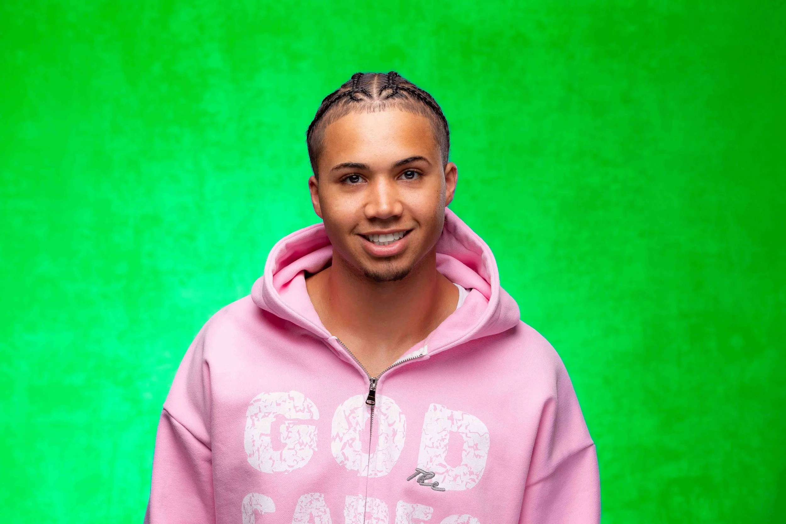
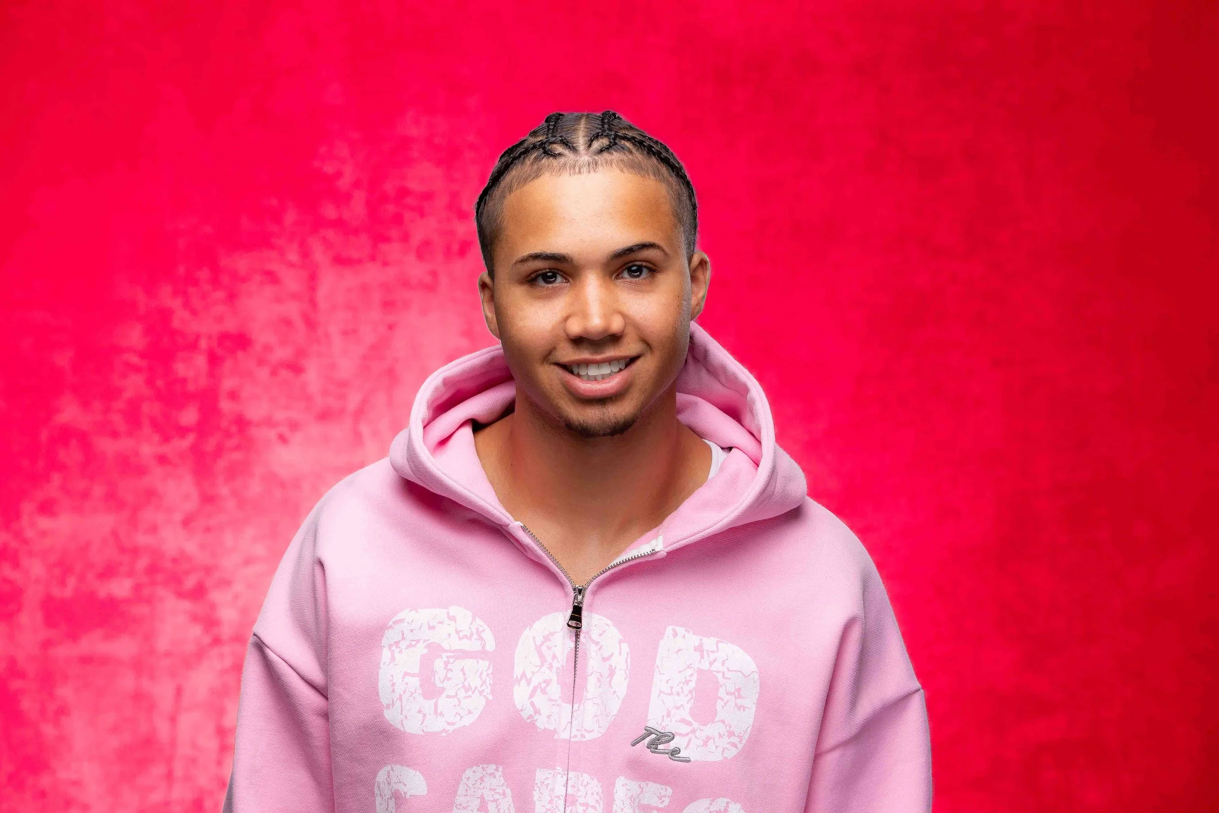
One Headshot Can Communicate Multiple Brand Messages
A common assumption is that different brand messages require completely different photos. In reality, the same well-lit, well-composed headshot can be presented in different ways simply by changing the background color.
This is especially valuable for professionals and small business owners in the DFW area who need one strong image to work across multiple platforms:
LinkedIn profiles
Company websites
Local business listings
Speaking engagements
Marketing materials
The subject remains the same:
Same expression
Same posture
Same lighting
Yet the perception shifts.
The flexibility comes from color, not from changing who you are.
What Headshot Background Colors Commonly Convey
While color meaning can be personal and contextual, certain associations are widely recognized in branding and visual communication.
Neutral Gray or Charcoal
Neutral tones are clean, modern, and versatile.
They are commonly used by executives, consultants, attorneys, and corporate professionals throughout Dallas–Fort Worth who want a polished look that works across many settings.
Blue
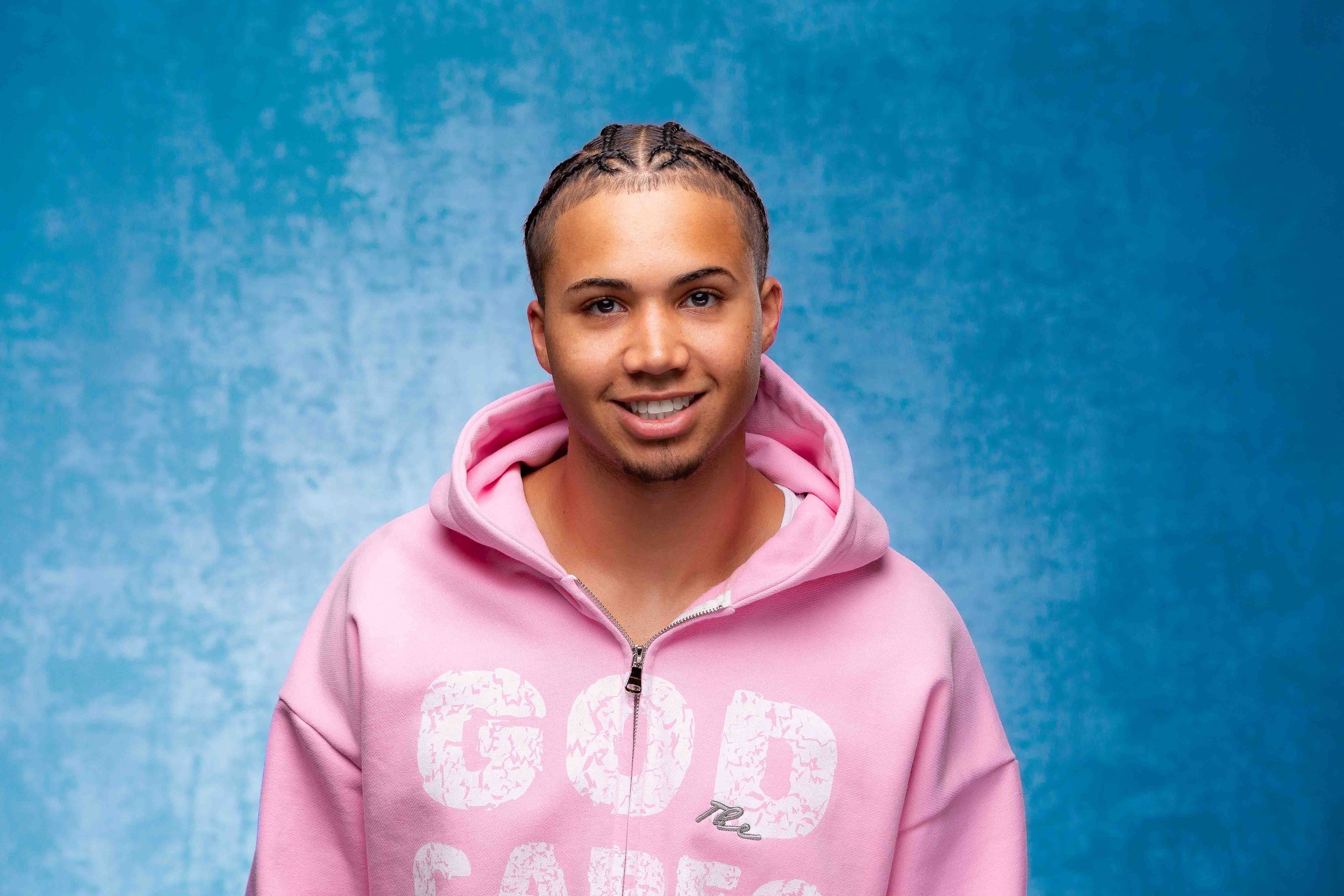
Blue is strongly associated with trust, reliability, and calm.
It is frequently chosen for leadership roles, finance professionals, healthcare providers, and corporate teams across the Metroplex.
Black
Black backgrounds create contrast and confidence.
They are often used by creatives, speakers, and entrepreneurs who want a bold, high-impact image.
White or Light Neutrals
Light backgrounds feel open and approachable.
They are popular for wellness professionals, educators, and modern personal brands.
Green
Green is associated with balance, growth, and stability.
It works well for professionals in education, sustainability, health, and community-focused roles.
Brighter or More Expressive Colors
Bold colors can communicate creativity, individuality, and energy.
They are often chosen by artists, performers, and business owners whose brand benefits from standing out in a competitive local market.
There is no universally “correct” background color. The right choice depends on how you want to be perceived and where the image will be used.
Branding Is About Alignment, Not Uniformity
Effective branding is not about fitting into a template. It is about alignment between:
Who you are
What you do
How others experience you
In a region as diverse as Dallas–Fort Worth, professionals represent a wide range of industries, cultures, and personalities. A professional headshot should reflect that diversity, not erase it.
When people are forced into a look that doesn’t reflect them, it shows, often in their expression.
When clients are given thoughtful options and clear guidance, they tend to relax. Their posture softens. Their expression becomes more natural. The final image feels confident rather than staged.
The Role of Comfort and Trust in Headshot Photography
Beyond aesthetics, the photography experience itself matters.
People do not photograph well when they feel judged, rushed, or pressured to conform. They photograph well when they feel respected, listened to, and supported.
A welcoming studio environment shows up in practical ways:
Taking time to understand how the headshot will be used
Offering background and styling options without assumptions
Creating a calm, professional setting
This is especially important for clients who may already feel uneasy in front of a camera.
Why Subtle Inclusivity Matters in Professional Photography
Not everyone wants their headshot to make a statement. Many professionals simply want an image that represents them accurately and professionally, whether they work in corporate offices, creative fields, healthcare, education, or run their own local business.
Providing options, rather than imposing a single look, is one of the most effective ways to create an inclusive experience.
Choice communicates respect. It sends a quiet message:
You are welcome here.
That message resonates across the Dallas–Fort Worth professional community, even when it’s never spoken aloud.
How Choice Improves Headshot Results
From a practical perspective, offering background options leads to better outcomes.
When clients:
Understand how color affects perception
See examples of the same headshot presented in different ways
Feel involved in the decision-making process
They are more confident in their selection and more satisfied with the final images.
This leads to:
Greater usage across platforms
Longer lifespan for the headshot
Stronger personal or professional branding
A headshot that feels right gets used. A headshot that doesn’t often sit unused.
Headshots Are About Representation, Not Perfection
A professional headshot is not meant to create a different version of you. It is meant to represent you clearly, confidently, and accurately.
Background color supports that goal. It doesn’t define you, it frames you.
Whether someone wants a classic corporate look, a modern minimalist feel, or something more expressive, the objective remains the same:
An image that feels authentic and professional.
Our Approach at TRG Headshots
At TRG Headshots, we work with professionals, entrepreneurs, and job seekers throughout the Dallas–Fort Worth area to create headshots that feel both polished and personal.
We believe:
A single great headshot can serve multiple purposes
Background color is a branding tool, not a trend
Feeling comfortable leads to better photographs
Our focus is on creating flexible, studio-quality headshots that work in real-world professional settings, while making sure every client feels respected and supported throughout the process.
Because when people feel at ease, it shows.
And when a headshot reflects who someone truly is, it does exactly what it’s meant to do:
make a strong, confident first impression.