
Business Headshot Background Ideas for Professional Look
When I first started thinking about getting new headshots for my business, I didn't give the background much thought. I figured, "It's just a picture, right?" But the more I looked into it, the more I realized how much that simple backdrop actually does. It's not just filler; it's a key part of the story your photo tells.
Why the Right Business Headshot Background Matters
Think about it. Your headshot is often the very first impression someone gets of you professionally. It's what people see on your LinkedIn profile, your company website, or even in an email signature. If the background is distracting or doesn't align with your industry, it can convey the wrong message. A busy, cluttered background might make you seem disorganized, while a background that's too casual could make you appear less serious about your work.
Here's what I've learned about why it's so important:
It sets the tone: Is your business formal and corporate, or more creative and relaxed? The background should hint at that. A clean, neutral background often works for many professions, but sometimes a bit of office environment or even an outdoor setting can add personality.
It helps you stand out (or blend in): Depending on your goals, you might want a background that makes you pop, or one that subtly supports your brand. For example, using your company's colors can create a strong brand connection.
It adds professionalism: A well-chosen background, combined with good lighting, makes your headshot look polished and intentional. It shows you've put thought into your professional image.
The background isn't just scenery; it's a deliberate choice that influences how viewers perceive you and your business. It works alongside your expression, attire, and pose to create a complete professional picture.
Getting this right can make a big difference in how potential clients or employers see you. It's worth taking the time to consider your options, just like you would when choosing your professional attire. It really is an investment in your professional narrative.
Choosing a Neutral Background for a Clean Business Headshot Background
When I'm aiming for a straightforward, professional look in my business headshot, I often find myself gravitating towards a neutral background. It’s a classic choice for a reason. A neutral backdrop keeps the focus squarely on me, my expression, and my attire. It removes any potential distractions that might pull the viewer's eye away from what's most important: my face and the message I'm conveying.

Think about it: a busy or overly colorful background can sometimes compete with your subject. With a neutral option, that competition is gone. It’s like clearing the clutter from a room so you can see the main piece of furniture clearly. This approach works across many industries, from finance to law, where a sense of seriousness and reliability is key. It’s a safe bet, but more than that, it’s an effective one for projecting competence.
Here are a few common neutral choices and why they work:
Solid White: This is incredibly clean and modern. It can make the subject pop, especially if they are wearing darker clothing. It feels very crisp and professional.
Shades of Gray: From light to dark charcoal, gray offers a sophisticated and understated look. It’s versatile and pairs well with almost any color of clothing.
Solid Black: A black background can add a dramatic and serious feel. It’s excellent for creating a strong silhouette and can make lighter clothing or skin tones stand out.
The simplicity of a neutral background allows for a direct connection with the viewer. It says, 'I am here, I am professional, and I am ready to do business.' There's no ambiguity, just a clear presentation of the individual.
When I’m selecting a neutral background, I also consider the lighting. Even with a plain backdrop, how the light falls can create subtle shadows or highlights that add depth. I usually ask my photographer to ensure the lighting is even and flattering, avoiding harsh shadows that could be distracting. It’s all about creating a polished, approachable, and undeniably professional headshot background.
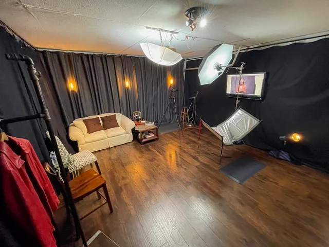
Using Office Environments as Natural Business Headshot Backgrounds
Sometimes, the best backdrop for your professional headshot is already right there where you work. Using your office environment can really show people what you do and where you do it. It adds a layer of authenticity that a plain studio backdrop just can't match. Think about it: if you're a graphic designer, having a hint of your creative workspace behind you can say a lot. Or if you're in finance, a clean, modern office setting can convey stability and professionalism.
When I've shot in offices, I've found a few things tend to work well. You don't want the background to be too busy, or it'll pull attention away from your face. Usually, a slightly blurred background works best. This way, you get the sense of place without all the distracting details.
Here are some ideas for using your office space:
Your actual desk area: Make sure it's tidy! A clean desk with maybe a plant or a subtle piece of company branding can be great.
A common area or lounge: These often have more interesting architecture or decor that can make for a nice, softer background.
A conference room: The clean lines and professional feel can work, especially if the room has good natural light.
Near a window with a view: If you have a nice city or nature view, even if it's blurred, it can add a sophisticated touch.
The key is to make the environment complement you, not compete with you.
It's also important to consider the lighting. Natural light from windows is often the most flattering. If you're shooting in a darker corner, we might need to bring in some extra lights to make sure you stand out clearly against the office setting. We want to capture you looking your best, with the office adding context rather than distraction.
Using your actual workspace can tell a story about your profession and your company culture. It grounds your professional image in reality and can make you seem more approachable to potential clients or colleagues.
Incorporating Brand Colors in Your Business Headshot Background
Using your company's colors in your headshot background can be a really smart way to tie your image directly to your brand. It's like a visual handshake, immediately telling people who you are and what you represent. I've found that when done right, it makes the whole personal brand feel more cohesive.
Think about the psychology of color. Blue often suggests trust and stability, which is great for finance or legal fields. Green can imply growth and health, fitting for environmental or wellness businesses. Red is bold and energetic, good for sales or creative industries. Even softer shades can carry meaning. Choosing a color that aligns with your company's core values is key.
Here's a quick look at how different colors might be perceived:
| Color | Potential Meaning |
|---|---|
| Blue | Trust, Stability, Calm |
| Green | Growth, Harmony, Nature |
| Yellow | Optimism, Warmth, Creativity |
| Red | Energy, Passion, Boldness |
| Purple | Royalty, Wisdom, Ambition |
It's not just about slapping your logo color behind you, though. The shade and intensity matter a lot. A bright, saturated color can be very energetic, while a muted or pastel version might feel more subdued and sophisticated. I usually recommend discussing this with your photographer. They can help you find a shade that works well with your skin tone and the clothes you plan to wear, so you don't end up looking washed out or clashing.
The goal is to make the color a supportive element, not a distraction. It should complement your expression and attire, reinforcing your professional image without overwhelming it. Sometimes, a subtle hint of brand color, perhaps in a slightly blurred background or a carefully chosen prop, can be more effective than a solid, bright block of color.
Consider how the color will interact with your clothing. If your company's primary color is a strong blue, wearing a complementary color like orange or a neutral gray can make the blue background pop. Or, if you're wearing a blue shirt, a more neutral background might be better to avoid too much of one color. It's a balancing act, for sure.
Textured or Patterned Business Headshot Backgrounds: Pros & Cons
When I first started thinking about my business headshot, I mostly considered plain backgrounds. You know, the usual solid colors or maybe a slightly blurred office scene. But then I started looking at options with a bit more texture or pattern, and it got me thinking about the good and the not-so-good.

The main thing to remember with textured or patterned backgrounds is that they should support, not compete with, you. If the pattern is too busy or the texture too rough, it can pull attention away from your face, which is the whole point of a headshot, right?
Here's a quick rundown of what I found:
Pros:
Adds visual interest and depth without being distracting, if done right.
Can communicate creativity or individuality, which is great for certain industries.
A subtle pattern can make a plain background feel more dynamic.
It can help you stand out from a sea of plain backgrounds.
Cons:
Risk of being too busy and distracted from your face.
It can sometimes look dated or unprofessional if the pattern isn't chosen carefully.
It might not work for very conservative industries.
It can be tricky to get the lighting just right so the texture doesn't create odd shadows.
For example, I saw some shots with a subtle linen texture, and it added a nice, almost tactile quality without being overwhelming. Then there were others with geometric patterns that were a bit too much for my taste – they felt like they belonged in a wallpaper sample book, not a professional photo.
When considering these types of backgrounds, it's a good idea to think about your specific field. A graphic designer might pull off a more artistic pattern than, say, a financial advisor. The goal is always to make sure the background complements your professional image, not detracts from it.
Ultimately, if you go this route, I'd suggest keeping it simple. Think subtle textures like a fine weave, a soft gradient, or a very understated geometric shape. And always, always check how it looks with your outfit and your expression. A good photographer can help you figure out if a textured background will work for you.
Outdoor and Architectural Settings as Business Headshot Backgrounds
Stepping outside the studio can really bring a fresh perspective to your professional headshot. I've found that using outdoor or architectural settings can add a unique layer of personality and context to an image. Think about a cityscape behind you, or perhaps some nice greenery. It can make the photo feel more dynamic and less staged.
When I consider these kinds of backgrounds, I'm always thinking about how they relate to the person's profession or personal brand. For instance, someone in architecture might look great with a modern building in the background. Or, if you work in environmental conservation, a natural setting like a park or forest makes perfect sense. It's about telling a bit of your story without saying a word. The key is to ensure the background complements you, rather than competes for attention.
Here are a few ideas I often explore:
Urban Environments: City streets, bridges, or even interesting building facades can offer a sophisticated and modern feel. This works well for professionals in tech, finance, or creative industries who want to convey a sense of being current and connected.
Natural Landscapes: Parks, gardens, beaches, or mountains provide a sense of calm, growth, and approachability. This is fantastic for those in wellness, coaching, or any field that benefits from an association with nature and tranquility.
Architectural Landmarks: Unique buildings, historical sites, or even modern art installations can add a touch of prestige and character. This can be particularly effective for professionals in the arts, culture, or those who want to project an image of stability and vision.
When shooting in these locations, I pay close attention to the light. The time of day can drastically change the mood. Early morning or late afternoon light is often softer and more flattering. I also think about the depth of field. Sometimes, a slightly blurred background, known as bokeh, can help you stand out while still giving a sense of place. It's a delicate balance, but when it works, it really makes the photo pop. For professionals looking to add a distinctive touch to their portraits, exploring these natural backdrops can be a game-changer.
Digital / Virtual Business Headshot Backgrounds: Tips & Pitfalls
In today's connected world, digital and virtual backgrounds for business headshots have become quite common. I've found they can be a real mixed bag. On the one hand, they offer incredible flexibility. Need to look like you're in a bustling city square or a serene office? A virtual background can do that. It's a way to create a specific impression without actually being there. This can be particularly useful for remote workers or those who frequently attend virtual meetings.
However, there are definite pitfalls to watch out for. The most common issue I see is the 'halo effect' or the background not quite blending properly with the subject. This often happens when the lighting isn't consistent between the person and the virtual backdrop. It can make the whole image look a bit amateurish, which is the opposite of what we're going for with a professional headshot.
Here are some things I keep in mind when considering or using virtual backgrounds:
Lighting is Key: Make sure the lighting on you matches the lighting of the virtual background. If your background looks like it's daytime, your lighting should too. If it's nighttime, adjust accordingly.
Resolution Matters: Use high-resolution images for your virtual backgrounds. A blurry or pixelated background will detract from your professionalism.
Keep it Simple: Often, a simple, clean virtual background is best. Think solid colors or subtle gradients. Overly busy or distracting backgrounds can pull attention away from you.
Test It Out: Always do a test run before your actual headshot session or important virtual meeting. See how it looks on camera and make adjustments as needed.
While virtual backgrounds can offer a quick fix for creating a desired setting, they require careful execution. A poorly implemented virtual background can do more harm than good, making you appear less polished than you intend. It's often better to opt for a simpler, well-lit real background if you're unsure about achieving a convincing virtual effect.
Another common problem is when the virtual background is too generic or doesn't align with your personal brand. If you're in a creative field, a standard corporate office background might not be the best fit. Conversely, if you're in finance, a wild, abstract background might send the wrong message. I've learned that consistency is important; the background should support, not compete with, your professional image.
Lighting & Depth: Enhancing Your Business Headshot Background
When I'm thinking about a headshot, the background isn't just a backdrop; it's a partner in telling the story. Lighting and how we manage depth of field play a huge role in making that background work for, not against, the main subject – which is you, of course.
Getting the lighting right on the background can make a subject pop. It's about creating a bit of separation between you and whatever is behind you. Sometimes, this means adding a subtle light to the background itself. This prevents the image from looking flat and can add a sense of dimension. It’s not about making the background bright and distracting, but rather giving it just enough attention so it feels like a considered part of the composition. Think of it like a soft halo, drawing the eye back to your face.
Here are a few ways I approach managing depth:
Wide Aperture (Low f-stop): Using a lens with a wide aperture, like f/2.8 or even lower, will naturally blur the background. This is fantastic for making you the undeniable focus. It works well when the background itself isn't particularly interesting or could be distracting.
Narrow Aperture (High f-stop): If the background is an asset – maybe it's your office, a cool architectural feature, or a subtle texture – I'll use a narrower aperture, perhaps f/8 or f/11. This keeps more of the background in focus, adding context. The trick here is to make sure the background elements don't compete with your face.
Subject-to-Background Distance: Simply moving further away from the background, or closer to you, can also affect how blurred it appears. The greater the distance, the more pronounced the blur will be with a wide aperture.
Managing the background's focus and light is a balancing act. You want it to add to the overall professional feel without pulling attention away from your expression and what you're conveying.
It’s about creating a visual hierarchy. Your face is at the top, and the background supports it. Too much detail or too much light on the background, and it can become a distraction. Too little, and the image might feel unfinished or flat. Finding that sweet spot is where the magic happens, making your headshot both engaging and professional.
Final Touches: Editing & Polishing Your Business Headshot Background
Once the photo is taken, the work isn't quite done. Editing and polishing the background of your business headshot is where the magic really happens. It’s about making sure the backdrop supports your image without stealing the show. I usually start by looking at the overall clarity. Is the background sharp enough to look intentional, but soft enough not to distract? Sometimes, a little blur, often called bokeh, can really make you pop. It's a nice touch for creative fields, giving a sense of depth and innovation.
Adjusting the colors is another big step. If the background has a slight tint, I might tweak it to better match my brand's palette. This is where you can really tie everything together. For instance, if my brand uses a specific shade of blue, I'll make sure the background has a subtle hint of that. It’s these small details that make a headshot feel cohesive.
Here are a few things I typically check during the editing process:
Color Balance: Ensuring the background colors are true and complement my attire.
Sharpness/Blur: Finding the right level of focus so the background adds depth but doesn't compete.
Cleanliness: Removing any stray marks, dust, or distracting elements that weren't noticed during the shoot.
Lighting Consistency: Making sure the light on the background matches the light on my face.
Sometimes, the simplest edits make the biggest difference. It’s not about changing the background entirely, but about refining it so it perfectly frames the subject. Think of it like framing a piece of art; the frame should complement the painting, not overpower it. This careful attention to detail is what separates a good headshot from a great one.
If the original background wasn't quite right, or if I need something specific quickly, I might look into using digital options. Tools like AI headshot generators can create professional-looking backgrounds, but it's important to use them wisely. The key is to make sure the digital background looks natural and fits the overall tone of the photograph. It should feel like a real place, not just a flat image pasted behind me. Getting this right takes a bit of practice, but it’s a great way to get a polished look without needing a studio.
Making sure your business headshot background looks great is the final step to a perfect photo. A clean, professional background makes you stand out. Want to see how we can help you achieve a stunning headshot? Visit our website today to learn more!
Frequently Asked Questions
-
I believe the background is like the frame for a picture; it helps people focus on you. A good background makes me look more professional and can even show a bit about what I do for work. It's my first impression, so I want it to be a good one.
-
I find that plain backgrounds, like white, gray, or black, are great when I want the focus to be entirely on my face and what I'm wearing. They're simple and clean, which makes me look very professional and keeps things from being distracting.
-
Yes, I think using my office environment can be a smart choice. It shows where I work and can make me seem more real and dedicated to my job. It's a natural way to connect with people and show them I'm in my element.
-
I think using brand colors can be very effective. It helps tie my headshot to my company's image and makes me look like a strong part of the team. It's a subtle way to reinforce my brand.
-
A textured or patterned background can add some visual interest and make my photo more unique. However, I need to be careful that the pattern doesn't become too busy and take attention away from my face. It's a balance I have to find.
-
I've seen that outdoor or city backgrounds can give my headshot a more modern and dynamic feel. They can show that I'm active and perhaps work in a field that's vibrant or innovative. I just need to make sure the background doesn't overpower me.