
How to Choose Best Background for Professional Headshots
Choosing the right backdrop for your professional headshots is more important than many people realize. It's not just about having a picture taken; it's about making a first impression, and the background plays a big part in that. I've learned that the best background for professional headshots depends on what you want to say about yourself and your work. Let's look at how to pick the best background for professional headshots.
Why Your Headshot Background Matters
When I first started thinking about getting new professional headshots, I honestly didn't give the background much thought. I figured, as long as it wasn't too distracting, it would be fine. But the more I looked into it, the more I realized just how much the background matters. It’s not just about having something behind you; it’s about what that something says about you and your brand. Choosing the best background for professional headshots is a surprisingly big deal.

It Sets the Tone
The background is one of the first things people notice, even if they don't consciously realize it. It can instantly communicate a feeling or a vibe. A clean, solid color might say 'professional and no-nonsense,' while a blurred outdoor scene could suggest 'approachable and creative.' It’s a silent communicator, and you want it to say the right things.
It Keeps the Focus on You
This is probably the most important reason. The goal of a professional headshot is to showcase you. The background should support that, not compete with it. If the background is too busy, too bright, or too detailed, it can pull attention away from your face, which is the main subject. I learned that a good background should be subtle enough that it doesn't distract, but interesting enough that it adds a bit of polish. Think of it like a frame for a painting; it should complement the art, not overpower it.
It Can Complement Your Brand
Different industries and personal brands call for different backgrounds. For instance, someone in a creative field might opt for something a bit more unique, perhaps a textured or subtly colored backdrop. On the other hand, a corporate executive might need a more traditional, neutral background to convey authority and seriousness. It’s about making sure the visual context aligns with your professional identity. I found that considering my industry helped narrow down the options considerably when looking for the best background for a professional headshot.
It Affects the Overall Professionalism
Let's be honest, a poorly chosen background can make even the most well-lit and well-posed photo look amateurish. Busy patterns, clashing colors, or distracting elements can detract from the overall quality. On the flip side, a well-chosen background, like a simple gray or a softly blurred office setting, can make your headshot look polished and high-end. It shows you've paid attention to the details, which reflects well on your professionalism.
The right background helps you stand out for the right reasons, making sure your first impression is a strong and memorable one.
Solid-Colored Backdrops
When I first started thinking about getting new headshots, I didn't give much thought to the background. I figured, as long as it wasn't too busy, it would be fine. But after looking at some examples, I realized how much the backdrop can actually affect the overall feel of the photo. Solid-colored backdrops are often the go-to for a reason – they're classic, clean, and generally a safe bet for most professional situations.

The Power of Simplicity: Why Solid Colors Work
Solid colors, especially neutrals, don't compete for attention. This means the focus stays squarely on you, your expression, and your attire. It’s a straightforward way to present yourself professionally without any visual clutter. Think of it as a clean canvas that lets your personality and professional image take center stage. This approach is particularly effective for industries where a serious and polished image is expected, like law, finance, or medicine. A simple background helps convey a sense of stability and trustworthiness.
Popular Solid Choices and Their Impact
White: This is a bright and airy option. It can make you pop and give a very clean, modern feel. It's versatile and works well for tech, healthcare, and creative fields. A white backdrop can make your features stand out, creating a crisp look.
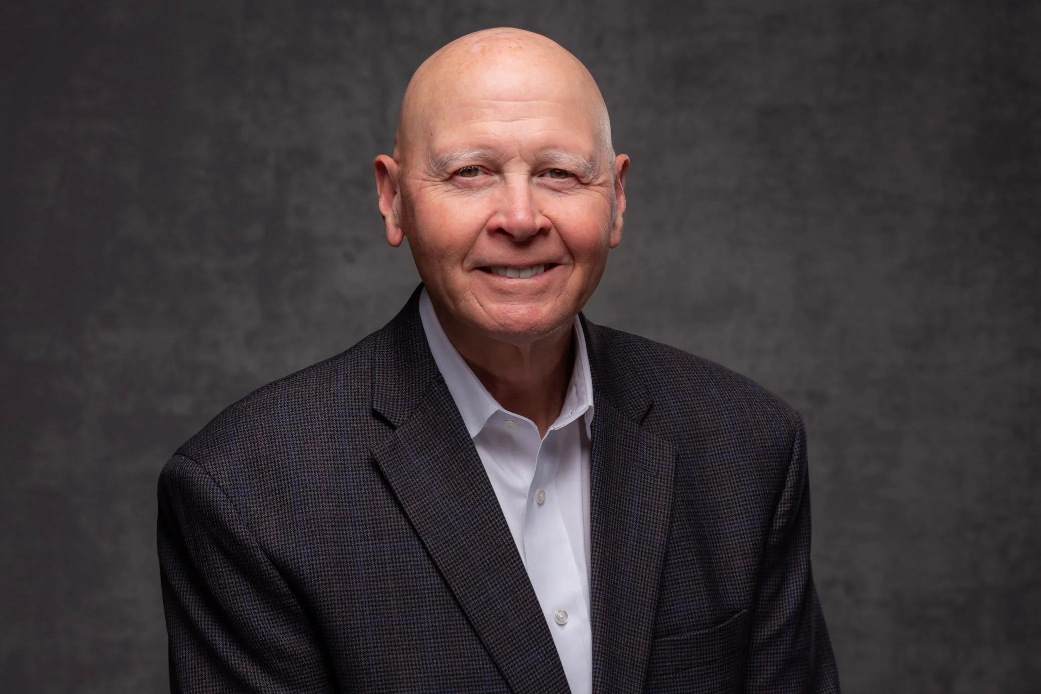
Gray: Gray is another fantastic neutral. It's sophisticated and timeless, offering a subtle contrast that can make your skin tone and clothing appear more dynamic. It’s a great choice for corporate settings, executives, or anyone wanting a polished, understated look. You can find a variety of gray options at places that offer professional headshot services.
Black: Black backgrounds create a more dramatic and elegant effect. They can convey authority and sophistication, making them suitable for formal business environments or creative industries. Black also provides a strong contrast, ensuring you stand out, especially if you're wearing lighter clothing.
Choosing a solid color is like picking a simple frame for a painting. It doesn't distract from the main subject, which in this case, is you. It’s about making sure your professional presence is what grabs the viewer’s attention, not the wall behind you.
Matching Your Outfit and Industry
When selecting a solid color, consider what you'll be wearing. A light-colored outfit will stand out beautifully against a dark background like black or a deep gray. Conversely, if you're wearing darker clothing, a white or lighter gray backdrop can help you pop. It’s all about creating a pleasing contrast so you don't blend into the background. Think about your industry, too; while black might be great for a lawyer, a slightly lighter, more vibrant solid might work better for a creative professional.
Neutral vs Bold: What Color Best Complements Your Brand?
When I first started thinking about my professional headshot, I spent way too much time on the background color. It felt like this huge decision, you know? Like, if I picked the wrong shade of blue, my whole career would somehow be affected. Turns out, it’s not quite that dramatic, but the color does matter. It’s less about some secret color code and more about what feels right for you and your work.
The Myth of Universal Color Meanings
I read a lot of stuff online that tried to tell me red meant power, green meant creativity, and so on. Honestly, it felt a bit much. Do the people hiring me care if my headshot screams “passion”? Probably not. They just want to see someone who looks capable and approachable. Trying to force a specific personality trait through color can be a distraction. Plus, what if your audience is from a different culture? What’s positive in one place might be negative somewhere else. It’s a lot to keep track of and, frankly, often unnecessary.
When Color Does Matter: Branding and Industry
There are a few times when color choice is more important. If your company has a specific brand color, matching that in your background or outfit can be a good idea. Similarly, if you work in an environmental field, a green background might subtly hint at nature. For aviation, a light blue could suggest the sky. These are subtle connections, though, not strict rules. The main thing is to avoid colors that clash or distract.
Choosing Colors That Complement You
Instead of focusing on what colors mean, I found it more helpful to think about what colors look good on me. This is where skin tone, hair color, and eye color come into play. You want a background that makes you pop, not blend in. For instance, if I have fair skin, a very light background might wash me out. Conversely, if my hair is very light, a pure white background might make it hard to see the details. It’s about creating a pleasing contrast.
Here’s a general idea of how colors might work with different complexions:
| Complexion | Best Background Colors (General) |
|---|---|
| Fair | Blues, Greens, Dark Grays, Black |
| Medium | Reds, Golds, Forest Greens, Browns, Purples |
| Dark | Almost any color, but a lighter element for contrast is good |
Ultimately, the best background color is one that makes you look your best and feels authentic to your professional image. Don't overthink the symbolism; focus on creating a clean, professional look that highlights you.
Practical Advice for Picking Your Shade
So, what’s my biggest tip? Wear what looks good on you. Seriously. If you feel confident and comfortable, it shows. The best way to figure this out is to try different colors in front of a camera, or at least in front of a mirror, and see what makes your features stand out. A good photographer can also help guide you on this. For a safe bet, neutral colors like gray or a soft blue are usually a good choice for most professions, offering a clean look that doesn't distract. You can explore different background color options to get a feel for what might work.
Gradient and Textured Backgrounds

Subtle Gradients: Adding Depth Without Distraction
Sometimes, a plain solid color can feel a bit too stark. That's where subtle gradients come in. Think of a background that shifts gently from a slightly darker shade at the bottom to a lighter one at the top, or vice versa. This technique adds a bit of visual interest and depth to your headshot without being overwhelming. It's like a soft spotlight that draws attention back to you. The key here is subtlety; the transition should be smooth and barely noticeable. It’s a great way to make your photo feel a little more dynamic than a flat color, but still keeps the focus squarely on your face. Many photographers use these for a clean, modern look that works across many industries. You can find some nice examples of middle gradient backgrounds online if you want to get a feel for them.
Textured Backdrops: Adding a Touch of Sophistication
Textured backgrounds can also be a fantastic way to add a professional yet stylish flair. I'm not talking about anything too busy, like a loud pattern. Instead, think about subtle textures like soft linen, a fine canvas, or even a very smooth concrete look. These textures add a tactile quality to the image, giving it a bit more substance and visual appeal. They can make your headshot feel more grounded and sophisticated. When choosing a texture, always consider how it will interact with your outfit and skin tone. A rougher texture might add a bit of grit, while a smoother one feels more refined. It's about finding that balance where the texture complements you, rather than competes with you.
When to Use Gradients and Textures:
Creative Industries: If you work in fields like design, marketing, or media, these backgrounds can show a bit of your creative flair.
Modern Professionalism: They offer a contemporary alternative to traditional solid backdrops, suitable for many business roles.
Adding Dimension: When you want a bit more visual pop than a plain color but need to maintain a professional look.
It's important to remember that even with gradients and textures, the background should never overpower you. The goal is to support your image, not to become the main subject. If the texture is too pronounced or the gradient is too harsh, it can become a distraction, which is exactly what we want to avoid in a professional headshot.
Environmental and Office Settings
Sometimes, a plain background just doesn't cut it. If you want your headshot to tell more of a story about what you do, using your actual work environment or a relevant setting can be a really smart move. It adds a layer of authenticity and can make you seem more approachable or grounded in your profession. Think about it: a lawyer in front of a courthouse, a chef in a clean kitchen, or a writer at a cozy cafe. It gives people an immediate visual cue about your world.
Office Interiors: Professionalism with Personality
Shooting inside your office can be great, especially if the space itself is visually interesting and tidy. It’s a way to show your professional side but keep it feeling a bit more casual and relatable. The key here is to make sure the background isn't too busy. We want the focus to stay on you, not on the filing cabinets or the coffee mugs. Sometimes, just blurring out the background slightly can give a nice sense of place without being distracting. It’s about hinting at your workspace, not giving a full tour.
Cityscapes and Urban Environments: Modern and Sleek
Using a city background, like a skyline or a street scene, can give your headshot a modern and dynamic feel. This works well for industries that are fast-paced or tech-focused. However, you have to be careful with this one. If the background isn't blurred enough, it can easily become too distracting and pull attention away from your face. It’s a balancing act to get that sense of place without overwhelming the shot. A good photographer can help manage the focus to keep you sharp and the background subtly present.
Natural Settings: Approachable and Grounded
For a more relaxed and approachable vibe, consider outdoor settings. Think parks, gardens, or even just a nice pathway with greenery. These kinds of backgrounds are generally less distracting than a busy city scene, so you don't always need to blur them out as much. It’s a great option for people in fields like real estate or anyone who wants to convey a sense of calm and connection to their environment. It can make you stand out in a good way. For example, using a nice greenery in the background can add a soft, natural touch.
Architectural Elements: Adding Character
Sometimes, interesting architecture can serve as a fantastic backdrop. This could be a modern office building, a historic brick wall, or even a unique pathway. The key is that the architecture should complement you, not compete with you. It adds character and can hint at your industry or location without being overly literal. Just be mindful of patterns or colors that might clash with your outfit or skin tone. A well-chosen architectural element can add a lot of visual interest and professionalism to your headshot.
Avoiding Mistakes
When I first started thinking about getting professional headshots, I figured the background was pretty straightforward. Just pick something clean, right? Well, it turns out there’s a bit more to it, and making the wrong choice can mess up the whole vibe. I’ve learned that some backgrounds can pull focus away from you, which is the last thing you want. It’s like wearing a loud shirt to a quiet meeting – it just doesn’t fit the purpose.
Busy Patterns and Visual Clutter
This is a big one. Anything too busy, like intricate wallpaper or a pattern that’s too loud, is generally a no-go. It makes your eyes jump around the photo instead of settling on your face. Think about it: if the background is doing a lot of visual heavy lifting, it’s not doing its job of supporting you. I’ve seen headshots where the background looked like a Jackson Pollock painting, and honestly, I couldn’t even tell you what the person looked like because my eyes were too busy trying to make sense of the chaos behind them. The goal is for the background to be a subtle support, not a main attraction.
Clashing Colors
Color is tricky. You don’t want a background color that fights with your outfit or your skin tone. For instance, wearing a bright red shirt against a bright blue background might be too much contrast, making the image feel jarring. Similarly, if your skin has a warm undertone, a background with a cool tone might not be the most flattering. It’s about creating harmony, not a color war. I remember one time I was considering a vibrant green backdrop, but my photographer pointed out it would make my skin look a bit sallow. Good catch!
Distracting Elements
This covers a lot of ground. Think about things like bright lights, sharp lines that cut across the frame, or even objects in the background that are too recognizable. If you’re in an office setting, make sure it’s tidy and not full of random papers or equipment. Even outdoor shots can go wrong if a lot is going on behind you, like a busy street or a lot of people walking by. The background should be so out of focus that you can’t tell what it is, or it should be a simple, solid color. It’s all about keeping the attention squarely on you. For some great ideas on what works, I found this professional headshot backgrounds article helpful.
When to Reconsider Certain Settings
While environmental or office settings can add context, they need careful consideration. A messy desk or a background with too many distinct elements can be distracting. Murals or graffiti, unless they are directly relevant to your brand or story, often draw too much attention. It’s better to err on the side of simplicity. If the background is too detailed, it can make your headshot look less high-end, as if you didn't put much thought into it. You want to look polished and serious about your career, and a chaotic background just doesn't convey that message.
Tailoring Your Choice
Choosing the right background for your professional headshot isn't just about picking a color you like; it's about making a strategic decision that aligns with your career, your style, and how you want to be perceived. Think of it as another tool in your professional branding arsenal. What works for a creative artist might not be the best fit for a financial analyst, and vice versa. It’s about creating a cohesive image that speaks to your industry and your individual presence.
Matching Background to Your Industry
Different professions have different expectations when it comes to visual presentation. For fields like finance, law, or engineering, a more traditional and conservative approach is often best. This usually means opting for darker, solid backgrounds. Think deep blues, grays, or even black. These colors convey seriousness, stability, and professionalism. For example, a dark gray backdrop can provide a sophisticated look that complements formal attire, making it a safe bet for many business professionals. On the other hand, industries that are more creative, relaxed, or people-focused might benefit from lighter or more subtly textured backgrounds. Consider light grays, soft blues, or even a gentle gradient. These can create a more approachable and friendly vibe, which is great for therapists, teachers, or those in the hospitality sector. Even an outdoor setting can work well for these roles, offering a sense of openness and connection.
Considering Your Skin Tone and Hair Color
Your background should make you stand out, not blend in. This means paying attention to contrast. If you have fair skin and light hair, a very light background might wash you out. Conversely, if you have dark skin and dark hair, a very dark background might make you disappear. The goal is to find a background that creates a pleasing separation between you and the backdrop. For instance, if my hair is a lighter shade, I might choose a medium-toned background to create a nice contrast. If I have darker hair, a lighter background could help my features pop. It’s also worth considering your skin’s undertones. While not always the primary factor, understanding if you have warm, cool, or neutral undertones can help guide your clothing choices, which in turn interact with the background. Generally, you want colors that complement your natural coloring without being too matchy-matchy. A good rule of thumb is to pick a background that is a few shades lighter or darker than your hair and skin tone to ensure you are the focal point.
Harmonizing with Your Outfit
Your outfit and the background need to work together. If I'm wearing a bright blue suit, I wouldn't want a bright blue background, as it would create a distracting, monochromatic effect. Instead, I might opt for a neutral background like a medium gray that allows my suit to be seen clearly without competing. Similarly, if I'm wearing a patterned shirt, a solid, simple background is usually the way to go. Busy patterns on both me and the background can be overwhelming. The idea is to create a clean, professional look where the background supports, rather than detracts from, the main subject – which is you. Think about the overall message you want to send. A classic, solid background often communicates reliability, while a more unique or subtly textured one might suggest creativity or a modern approach. It’s about making sure all the elements – you, your outfit, and the background – contribute to a unified and impactful professional image.
The most effective headshots are those where the background serves as a subtle enhancement, drawing attention to the subject without becoming a distraction in itself. It’s a delicate balance, but getting it right makes a significant difference in how your professional image is perceived.
Picking the right look for your photos is key! Think about what fits your job, your skin tone, and what you're wearing. Making sure your background matches your industry helps you look professional and put-together. Want to see how we can help you shine? Visit our website to learn more!
Frequently Asked Questions
-
When picking a background, I think about what I do for work and what kind of feeling I want my picture to give off. For serious jobs, I lean towards simple, plain colors like gray or blue. If my work is more creative or laid-back, I might choose something a bit more interesting, but I always make sure it doesn't take attention away from my face.
-
I find that solid, neutral colors are usually the safest bet. Think soft grays, blues, or even white. These colors help me stand out and look professional without being distracting. They also tend to work well with most outfits and skin tones.
-
I always try to make sure the background is a bit blurry or out of focus. This way, my face is the main thing people see. If the background is too clear or busy, it can pull the viewer's eye away from me, which isn't what I want for a professional photo.
-
I avoid backgrounds with lots of patterns, bright colors, or anything that might catch the eye too much. Things like busy wallpaper, strong lines, or very bright, flashy colors can make the photo look messy and take away from my professional look. I want the focus to be on me, not what's behind me.
-
Sometimes, using a real-life setting, like an office or a nice outdoor spot, can add context. I make sure the setting is neat and doesn't have too many distracting elements. For example, a clean office space or a park with soft greenery can work well if it fits my profession and makes me seem approachable.
-
Yes, I believe hiring a professional photographer is often worth it. They have the right equipment and know-how to get good lighting and focus, which helps make sure the background complements me perfectly. They can also guide me on the best choices based on my needs.